Back to demoTheme design bookID
FF

Form & Field / DESIGN SYSTEM

THE SYSTEM / AT WORK.

Acid yellow, dense type, visible structure. Hard edges and offset shadows make interaction part of the graphic language.

Open the website
Layout schematic of the implemented website

This book belongs to Form & Field. The catalogue website has a separate interface guide. Samples below reuse the components from this demo.

01 / FOUNDATIONS

Color, type & form

Hard borders. Offset shadows. Direct feedback.

Acid yellow#e5ef75
Ink#23251f
Paper#f4f1e9
Space Grotesk / DISPLAY
FORM. FIELD.

Inter Tight / READING & INTERFACE

Switch projects and canvas colors

02 / LIVE COMPONENTS

Studies & selection.

Switch projects and canvas colors
Change the mood
Choose a study
Signal / Identity

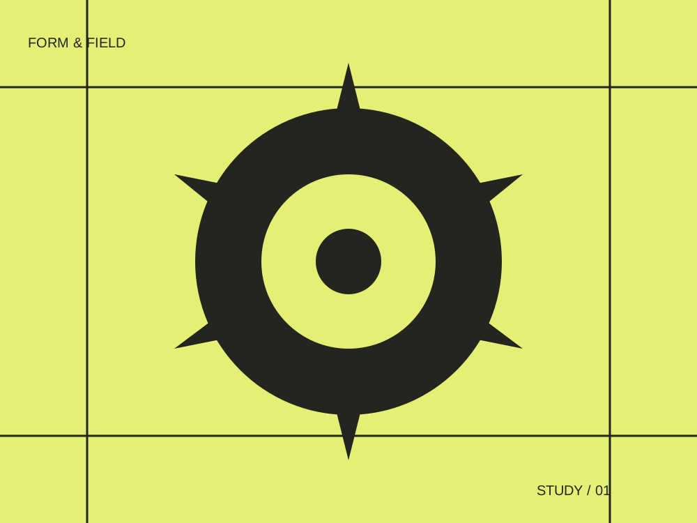
Graphic study / 01

A visual identity built from a single circular gesture. Simple enough to remember, flexible enough to play.

03 / INTERFACE DETAILS

The small things belong here too.

Try the select, focus the help button, and scroll the inventory. The popup and tooltip retain this theme’s character.

Space Grotesk sets account h1/h2 headings and wordmarks; Inter Tight carries reading text, fields and smaller headings.

Component inventory (scroll to inspect)

  1. 01
    Account typography

    Space Grotesk sets account h1/h2 headings and wordmarks; Inter Tight carries reading text, fields and smaller headings.

  2. 02
    Your brand on account pages

    The name and logo replace the wordmark. Main and second colours become readable ink and accent across account surfaces, inputs, actions, focus and reset dialogs. Backgrounds, artwork, lamp finishes and the dark Wayfinder fascia stay authored. Name-only brands and Show originals keep the authored colours.

  3. 03
    Application frame

    The dashboard is one proof sheet: a study index, the chosen proof with its caption, and a margin with the sheet number. Login and recovery are a typographic access slip with the form at its core.

  4. 04
    Identity

    Form & Field uses its own wordmark, independent of the catalogue.

  5. 05
    Selection

    Switch projects and canvas colors

  6. 06
    Select menu

    A keyboard-operated popup with this theme’s borders, type, focus and selected states.

  7. 07
    Tooltip

    Contextual help opens on hover or keyboard focus and closes with Escape.

  8. 08
    Scroll area

    A bounded region with a themed track and thumb. Wheel, touch and keyboard scrolling remain available.

  9. 09
    Focus & motion

    Visible focus and short, input-driven transitions. Reduced motion removes movement.

  10. 10
    Forms & validation

    The settings below use labeled inputs, radios, a switch and checkbox. Saving changes this theme’s actual local dashboard preferences.

  11. 11
    Dialog & feedback

    The reset dialog keeps this theme in its portal, returns focus, and makes the background inert. State tabs expose empty, error, loading and success transitions.

Forms, decisions & feedback

These are the working settings and state components used by this theme’s essential pages.

This label belongs to this browser’s demo preferences.
Row density
Workspace view

Workspace preview

Preview of the selected row spacing.

Explore this theme’s pages