Gilir / DESIGN & COMPONENTS
Gilir
Made of its own parts.
Take a number. At a small practice the first thing in a visitor’s hand is a ticket from the counter; Gilir makes that ticket the interface. A notched g plate names the counter, the opening is the counter form itself — a service lane and a sample slot as plain radios — and the result is one torn ticket: a large lane number, three label–value lines and a stub that always says it is a fictional sample. No portraits, slogans, ratings or promises about waiting.
01 / Palette & type
Enamel mint, deep green ink and bone paper, like a counter plate and the ticket in your hand; apricot only marks a choice that changed after the ticket was made, always with words. 1px ruled lines, square corners, a dashed tear with two punched notches. A choice shows a filled radio, a side rule and its lane letter — never colour alone.
#eaf1ee#193a3a#bfe0cf#f8faf6#f3c5a9Atkinson Hyperlegible Next 600, drawn to keep letters and figures apart, sets the wordmark, titles, lane letters and the ticket number, where A-014 must read at a glance (its zero is slashed). DM Sans carries labels, radios and notes.
02 / Composition & behavior
Nameplate and three page links over one rule, then the one line that says the demo is fictional. On wide screens the form sits left with the draft ticket on the right; the ticket page widens the ticket. Below 700px the links take their own row, the form reads service → slot → summary → button, and the full ticket appears once it is made, after its title and actions.
No animation: choices, the number and the notices change instantly, with no rolling digits and no call sound; nothing moves on its own.
Services and slots are native radios in fieldsets with legends (Tab, Space, arrows); the slot group waits for a service and says so. An incomplete choice is named next to its group, linked with aria-describedby, and focus moves there. Step marks pair a tick or a number with words and aria-current; page links use aria-current. A new ticket is announced and its title takes focus; clearing asks first.
03 / Controls, including the edges
Nameplate and three page links over one rule, then the one line that says the demo is fictional. On wide screens the form sits left with the draft ticket on the right; the ticket page widens the ticket. Below 700px the links take their own row, the form reads service → slot → summary → button, and the full ticket appears once it is made, after its title and actions.
Component inventory (scroll to inspect)
READ THE DESIGN
Why it is arranged this way.
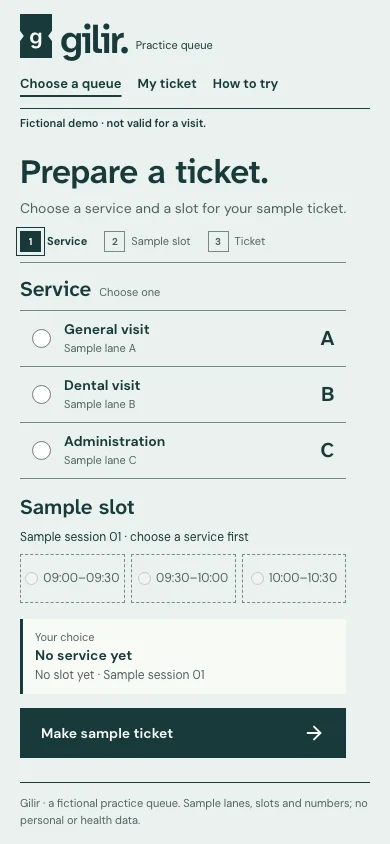
The capture shows the implemented opening. Notes connect its composition to the working experience and its mobile behavior.
- 01
The task is the title
The opening is the counter form, not a welcome: the h1 names the task, the step marks say what is done, and the fictional line sits once under the nameplate. On a phone the form and its button come before anything else.
- 02
Radios that read without colour
Services and slots are native radios in labelled groups. A choice shows a filled radio, a side rule and its lane letter; the slot group waits for a service and says so. An incomplete choice is named beside its group and takes the focus.
- 03
A ticket that says it is a sample
Beside the form the draft shows the lane letter and a dash until it is made; a made ticket shows its lane’s fixed sample number. The stub always says it is fictional and holds no personal data, and a brand cannot remove that line. On a phone a short summary stands in until the ticket page.
04 / Form & feedback contract
A local preparation note. Try an empty submission, correct it, then export your actual input.
Your prepared note will appear here.
05 / Actual working components
Activate the full workspace when you want to inspect it. Its interaction code loads on demand.