Kilau / DESIGN & COMPONENTS
Kilau
Made of its own parts.
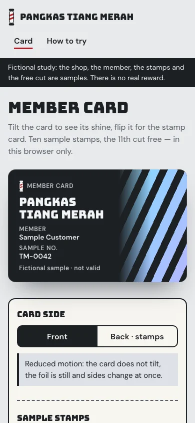
A stamp card in the pocket. A neighbourhood barber keeps regulars with a small printed card that gets a stamp per cut; Kilau makes that card the page. Its front is graphite with a foil of red-pole stripes that shines as it tilts, the shop’s name and a sample member; its back is pearl card stock with ten stamp rings, the tenth ringed red as the goal. Nothing on it reads as a bank card: no chip, long number, expiry or network mark.
01 / Palette & type
Graphite and chrome from the barber’s counter, red from the pole, pearl from the printed card. The front is a dark ID-1 card (1.586:1) whose right side carries a rainbow foil cut into diagonal pole stripes; the foil never sits under the text column. The back’s filled stamps are red-striped rings, the empty ones dashed and numbered. The rainbow is decoration only, never a colour that carries meaning.
#e8eaec#1d2024#b3242b#dde1e6#f7f5f0#565c65Bungee 400, drawn for vertical city signage like the board outside a barber’s, sets the wordmark, the titles, the name on the card and the stamp count; it stays legible on graphite and next to the foil. DM Sans carries labels, buttons and reading text with tabular figures. Rubik Mono One 400 stays an unused recorded fallback.
02 / Composition & behavior
Two pages, the card and How to try. At 1440 the card sits left, about 580px wide, and a 360px panel right holds the side switch, Shine once and the sample stamps. Below 760px it reads title → card the width of the screen → panel. The stamp count and the sample note are also in the panel at reading size, so the card’s small lettering is never the only source.
The card leans toward a pointer or a sideways finger (at most 8°, the shared demo-kit tilt) and the foil and its highlight move with it; vertical scrolling stays the browser’s. Shine once sweeps the card one way and back in 0.9s, for keyboards. Flipping turns the card in 0.48s; a new stamp is pressed in once. With reduced motion — also when it changes while the page is open — the card is flat, the foil still, Shine once hidden and sides change at once.
Front and Back · stamps are aria-pressed buttons; the hidden side is inert and focus stays on the button. Text on the card is measured against the actual foil pixels at 4.5:1 or more, and every fact on it is repeated in the panel. Adding a stamp is announced in a status line; a full card keeps the button focusable and says why it is off. Start the card over asks first and returns focus.
03 / Controls, including the edges
Two pages, the card and How to try. At 1440 the card sits left, about 580px wide, and a 360px panel right holds the side switch, Shine once and the sample stamps. Below 760px it reads title → card the width of the screen → panel. The stamp count and the sample note are also in the panel at reading size, so the card’s small lettering is never the only source.
Component inventory (scroll to inspect)
READ THE DESIGN
Why it is arranged this way.
The capture shows the implemented opening. Notes connect its composition to the working experience and its mobile behavior.
- 01
A member card, not a bank card
An ID-1 graphite card with the shop’s name, a sample member and a short sample number — no chip, long number, expiry or network mark. A visitor’s brand renames it and inks its front; the member and number stay labelled samples.
- 02
The foil keeps off the text
A CSS rainbow cut into barber-pole stripes moves with the tilt on the right of the card only, so the lettering reads at 4.5:1 or more on the actual pixels. Shine once sweeps it from a keyboard; reduced motion holds it still.
- 03
Stamps, said in words
The panel repeats the card: the count, how many stamps are left and that the free 11th cut is a sample. Adding a stamp turns the card to its back; a full card says so; storage that fails is reported, never hidden.
04 / Form & feedback contract
A local preparation note. Try an empty submission, correct it, then export your actual input.
Your prepared note will appear here.
05 / Actual working components
Activate the full workspace when you want to inspect it. Its interaction code loads on demand.