Nacre Rituals / DESIGN & COMPONENTS
Nacre Rituals
Made of its own parts.
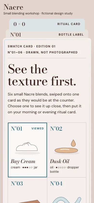
See the texture first. At a care counter, testers are swiped onto a card so textures can be compared side by side; online, that card is an honest stand-in for touch: drawn, not photographed, with no promised result. Its parts are the interface: the foil-edged card frames every page, numbered swatches are the product index, a loupe gives the close look, a printed runny → firm scale sorts the card, the cards stacked behind it are the navigation, and a two-sided ritual card is what the visitor takes home.
01 / Palette & type
Card stock, cocoa ink and abalone on a counter-pink ground; clay only inside the drawn swatches and bottles; a 3px pearl-sheen ring inside the card’s edge, without animation or texture. No photograph. Thickness reads as ●○ dots with words, a swatch already on a side is dashed and says so, and the active side is filled and pressed — never colour alone.
#f4eeec#3a2420#1d5a6e#e2d4cd#c58d72#d3dfe3Bodoni Moda 500, the high-contrast Didone of perfume and care labels, sets titles, swatch numbers and the wordmark; its italic names the swatches, the “for …” line and the note. DM Sans reads facts, controls and steps.
02 / Composition & behavior
Wordmark and storage status above the counter; the active card in front, the other two peeking from behind its right edge with upright labels. Below 900px the card fills the width and the other two become strips above it; text and actions come before the large drawings.
Two motions, both after a click and both through transform: sorting slides the swatches to their new places, and turning the label flips it over in 0.4 s. Reduced motion and constrained devices skip both; focus stays on the control that was pressed.
The swatches are one radio group (arrows, Home, End); sort order and card sides are pressed buttons; each step’s move and remove buttons are labelled and keep focus with the step; additions and refusals are announced. Thickness, “already on this side” and the active side are given in text as well as shape. Drawings are decorative beside their text; the vessel drawing carries its own description.
03 / Controls, including the edges
Wordmark and storage status above the counter; the active card in front, the other two peeking from behind its right edge with upright labels. Below 900px the card fills the width and the other two become strips above it; text and actions come before the large drawings.
Component inventory (scroll to inspect)
READ THE DESIGN
Why it is arranged this way.
The capture shows the implemented opening. Notes connect its composition to the working experience and its mobile behavior.
- 01
A swatch card, not a header
Six swatches drawn on one foil-edged card are the product index; each is a radio, so arrows move the loupe. Sorting runny → firm slides them into place. Nothing is photographed and no swatch promises a result.
- 02
The cards behind are the navigation
The bottle label and the ritual card peek from behind the active card with upright labels; they are ordinary links, next in focus after the wordmark. On a phone they become two strips above the card.
- 03
Facts are texture, vessel and scent
The loupe and the label’s back list only kind, thickness (dots with words), scent and vessel. The composition box stays empty for the owner; every export calls itself a concept, not a care recommendation.
04 / Form & feedback contract
A local preparation note. Try an empty submission, correct it, then export your actual input.
Your prepared note will appear here.
05 / Actual working components
Activate the full workspace when you want to inspect it. Its interaction code loads on demand.