Toko Saku / DESIGN & COMPONENTS
Toko Saku
Made of its own parts.
Ask before you pay. A small shop that sells over chat does not need a checkout; it needs a clear list to ask about. Toko Saku makes the shop’s note the interface: a pocket mark and a counter nameplate, a shelf of goods with item codes, and a narrow note with dashed rules that counts kinds and items — never money — and becomes one message. The note always says it is not sent and not a proof of payment.
01 / Palette & type
Warm note paper, petrol ink and a yellow shop label, like a counter pad and its price tags without the prices. Square corners, 1px rules and a 2px rule around the count, dashed lines between items and a serrated foot on the note. Six flat drawings made for this shop on peach, butter and sage grounds. Yellow marks the way to the note, never a control by colour alone.
#f5f0e3#174b52#f3cf63#e0e5db#fffdf6Barlow Semi Condensed 700, dense like a shop’s nameplate and its labels on a narrow strip, sets the wordmark, titles, product names and the item count. DM Sans carries the note’s lines, labels, buttons and the message; counts use tabular figures.
02 / Composition & behavior
A thin demo line, the nameplate, then a page bar with the way to the note that stays at the top while scrolling. On wide screens three columns of goods sit beside a narrow note; the note page sets the editable note left and the message right. On a phone the goods take two columns and the note follows them; its page reads note → message → copy and download → link → save, with the message folded.
Almost none: a line that changed is marked briefly and the note never scrolls itself. No confetti, no counters rolling; reduced motion removes the mark’s transition.
Categories are pressed buttons and the search has a label and a clear button. Each quantity is three separate controls — minus, a labelled number field and plus, 44px each — and minus is disabled at one rather than removing; removing is its own named button with a one-step undo. Changes are announced by one status line near the note, without moving focus. The message preview is a native disclosure; copy says “copied” only after the browser confirms.
03 / Controls, including the edges
A thin demo line, the nameplate, then a page bar with the way to the note that stays at the top while scrolling. On wide screens three columns of goods sit beside a narrow note; the note page sets the editable note left and the message right. On a phone the goods take two columns and the note follows them; its page reads note → message → copy and download → link → save, with the message folded.
Component inventory (scroll to inspect)
READ THE DESIGN
Why it is arranged this way.
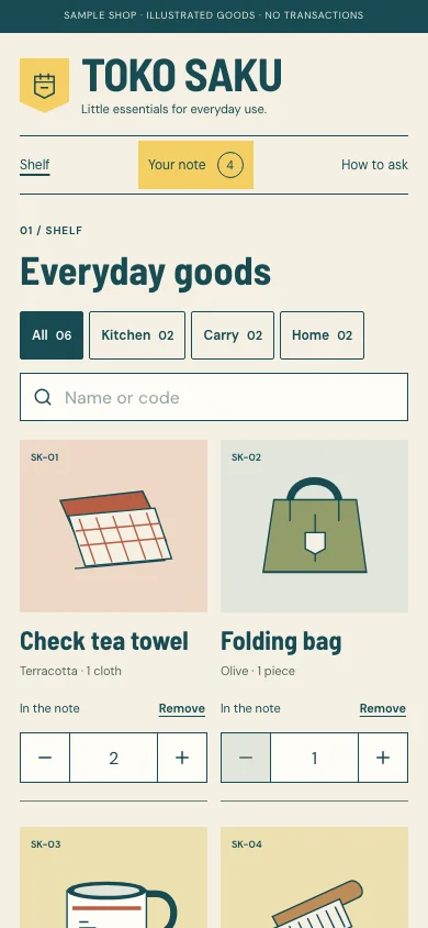
The capture shows the implemented opening. Notes connect its composition to the working experience and its mobile behavior.
- 01
The shelf is the opening
No hero or slogan before the goods: the nameplate and one demo line, then the h1 names the shelf, with categories as pressed buttons and a labelled search. Every card shows its item code, variant and unit — the same facts the note and the message carry.
- 02
Three controls, never a hidden remove
Once a good is in the note its card shows minus, a number field and plus, 44px each. Minus is disabled at one; removing is its own named button with one undo. A typed number is checked on leaving the field, and the note keeps the last valid count.
- 03
A note that is never “sent”
Beside the shelf the note counts kinds and items, never money, and its stamp always says not sent; changes are said once near it. On a phone the yellow way to the note stays in the page bar at the top while scrolling.
04 / Form & feedback contract
A local preparation note. Try an empty submission, correct it, then export your actual input.
Your prepared note will appear here.
05 / Actual working components
Activate the full workspace when you want to inspect it. Its interaction code loads on demand.